01 / Brief & Research
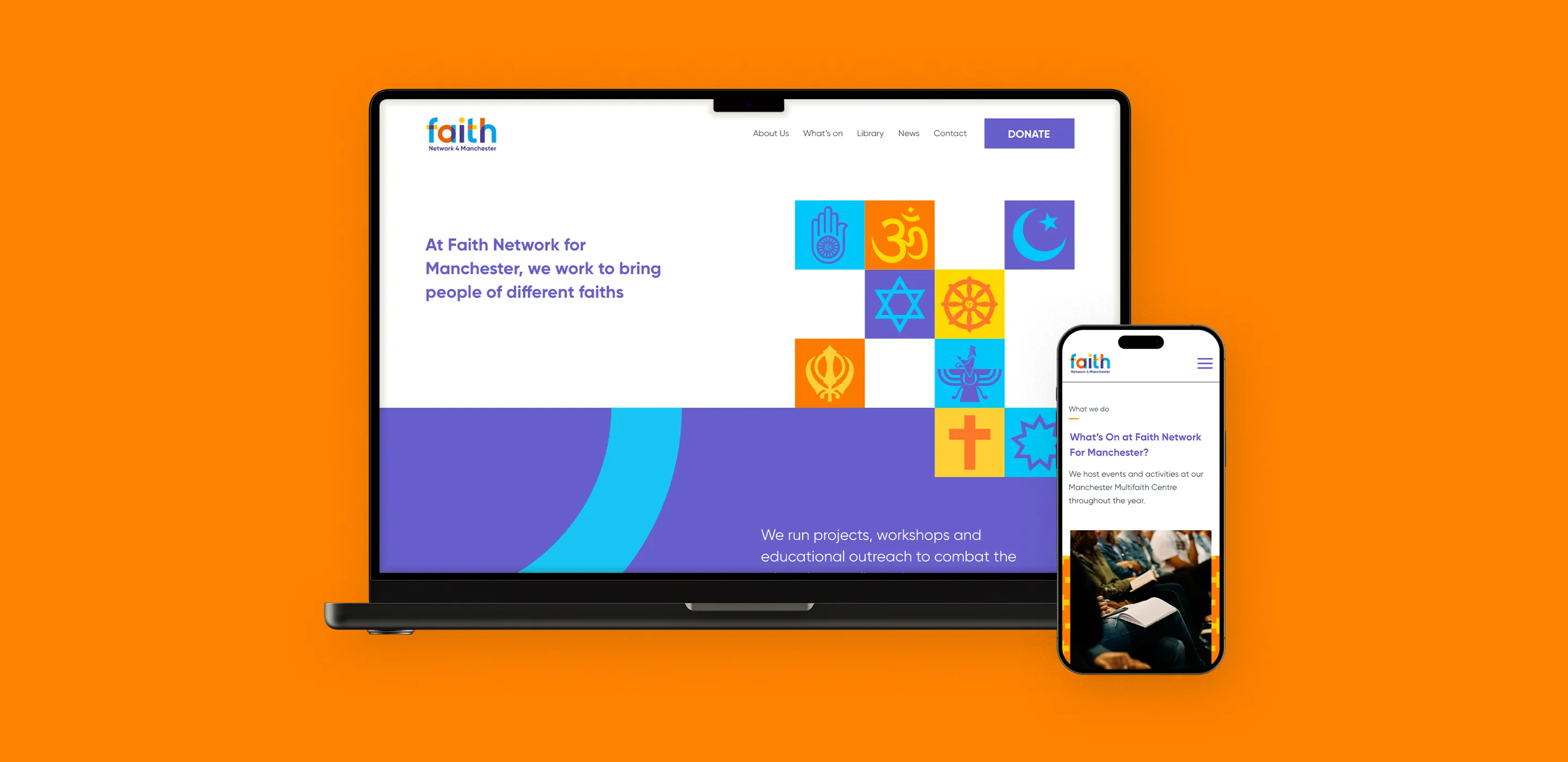
Faith Network for Manchester needed a clearer, more inclusive website.
It had to feel contemporary, neutral, and welcoming across faith communities.
The approach focused on:
- clearer information hierarchy and accessibility
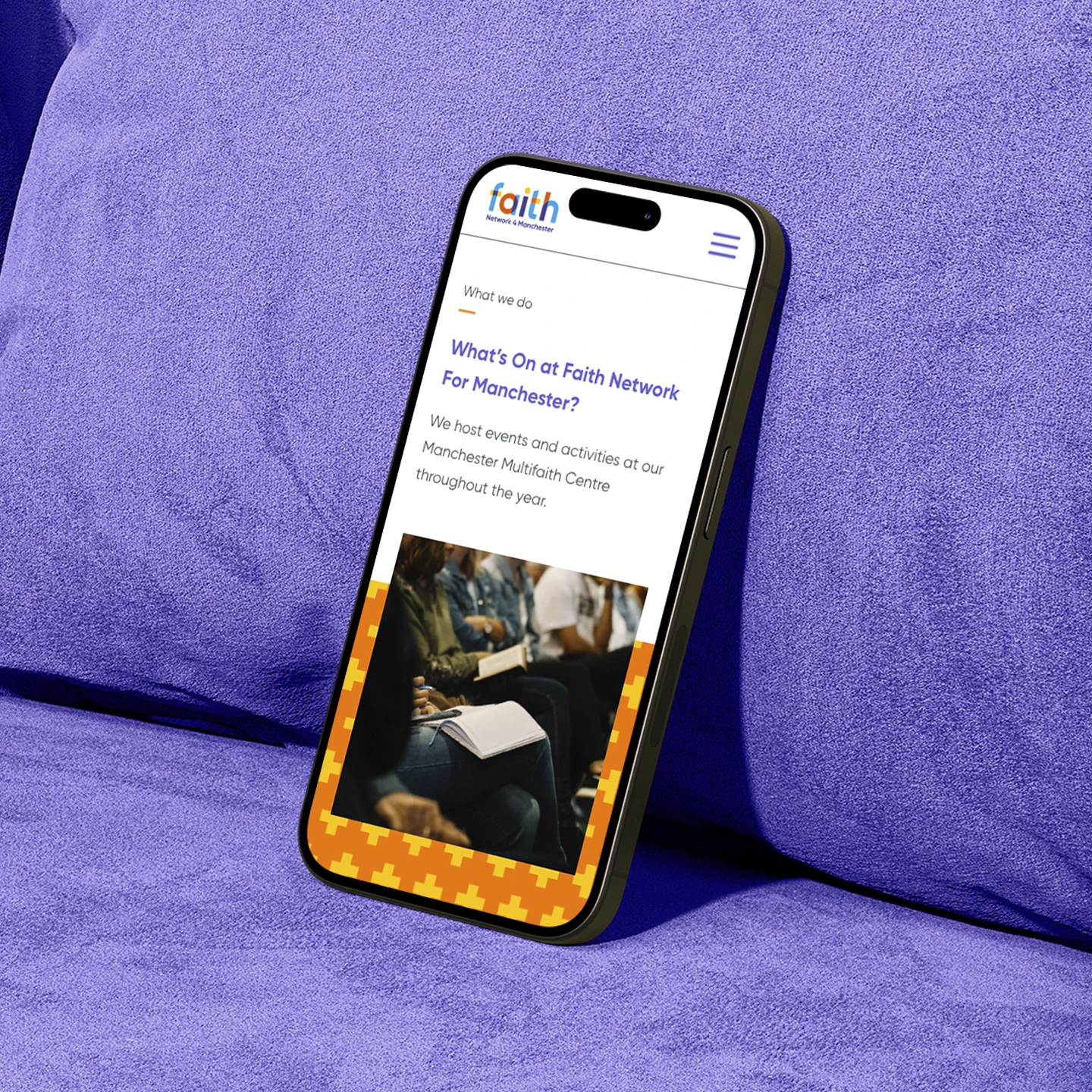
- simple UX for explore, learn, donate, and events
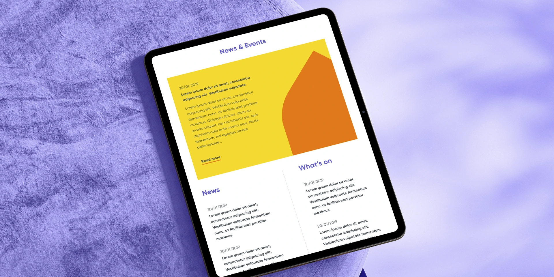
- responsive layouts built around readability
- translating the new brand into calm, functional webpages
The aim was clarity without losing warmth.
02 / Results
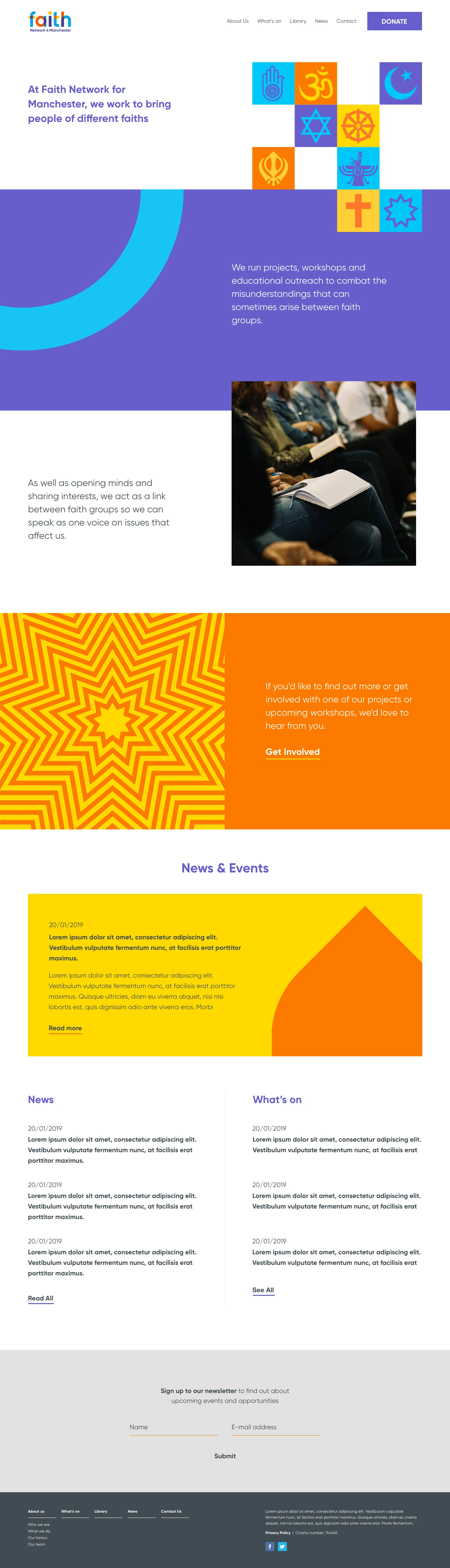
The resulting website delivers:
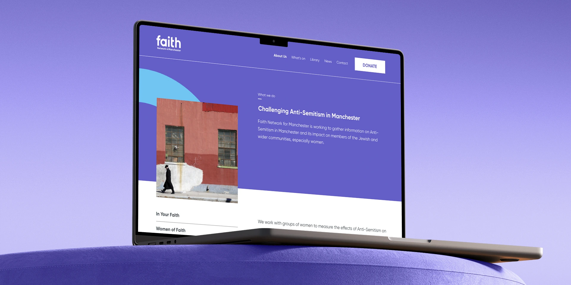
- a modern, inclusive, and accessible web presence reflecting the charity’s mission
- improved content clarity and navigation, helping users find what matters quickly
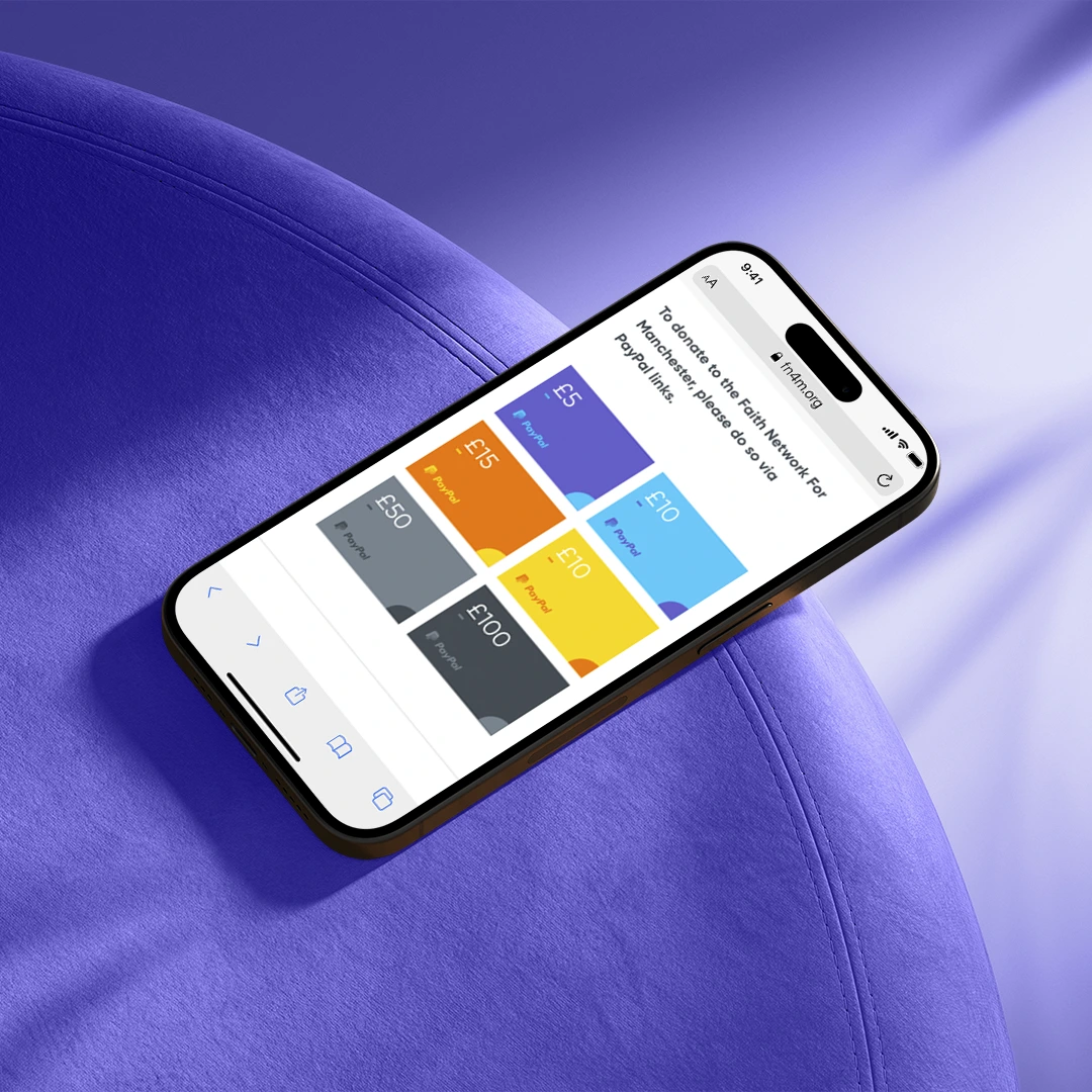
- a much easier donation experience, with clear card-based options and prominent CTAs
- a consistent visual system grounded in the established brand, flexible across breakpoints
The site now works as both a clearer information resource and a stronger touchpoint for community support.


03 / Impact
- Clearer communication of mission and values across digital touchpoints.
- Lower barrier to support through a more intuitive donation experience.
- A contemporary, inclusive website supporting community engagement.
01 / Brief & Research
Faith Network for Manchester needed a clearer, more inclusive website.
It had to feel contemporary, neutral, and welcoming across faith communities.
The approach focused on:
- clearer information hierarchy and accessibility
- simple UX for explore, learn, donate, and events
- responsive layouts built around readability
- translating the new brand into calm, functional webpages
The aim was clarity without losing warmth.
02 / Results
The resulting website delivers:
- a modern, inclusive, and accessible web presence reflecting the charity’s mission
- improved content clarity and navigation, helping users find what matters quickly
- a much easier donation experience, with clear card-based options and prominent CTAs
- a consistent visual system grounded in the established brand, flexible across breakpoints
The site now works as both a clearer information resource and a stronger touchpoint for community support.
03 / Impact
- Clearer communication of mission and values across digital touchpoints.
- Lower barrier to support through a more intuitive donation experience.
- A contemporary, inclusive website supporting community engagement.
Faith
UX and web design for a local charity focused on interfaith dialogue.
01 / Brief & Research
Faith Network for Manchester needed a clearer, more inclusive website.
It had to feel contemporary, neutral, and welcoming across faith communities.
The approach focused on:
- clearer information hierarchy and accessibility
- simple UX for explore, learn, donate, and events
- responsive layouts built around readability
- translating the new brand into calm, functional webpages
The aim was clarity without losing warmth.
02 / Results
The resulting website delivers:
- a modern, inclusive, and accessible web presence reflecting the charity’s mission
- improved content clarity and navigation, helping users find what matters quickly
- a much easier donation experience, with clear card-based options and prominent CTAs
- a consistent visual system grounded in the established brand, flexible across breakpoints
The site now works as both a clearer information resource and a stronger touchpoint for community support.
03 / Impact
- Clearer communication of mission and values across digital touchpoints.
- Lower barrier to support through a more intuitive donation experience.
- A contemporary, inclusive website supporting community engagement.