
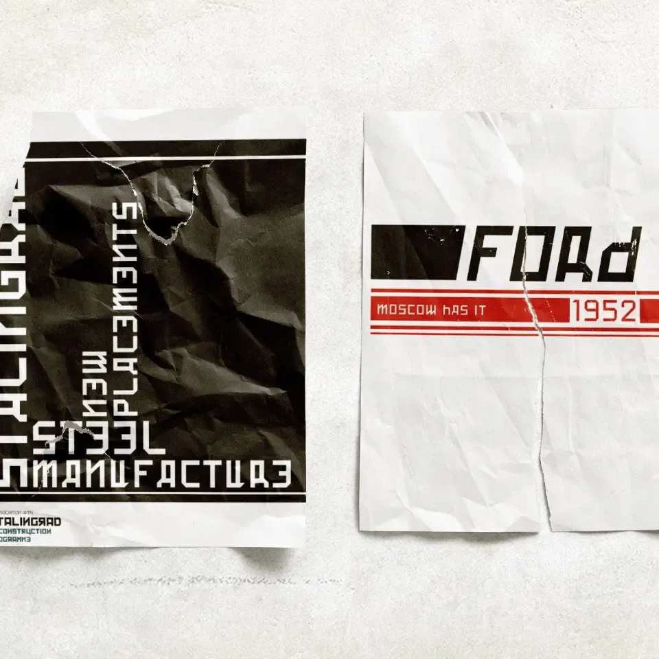
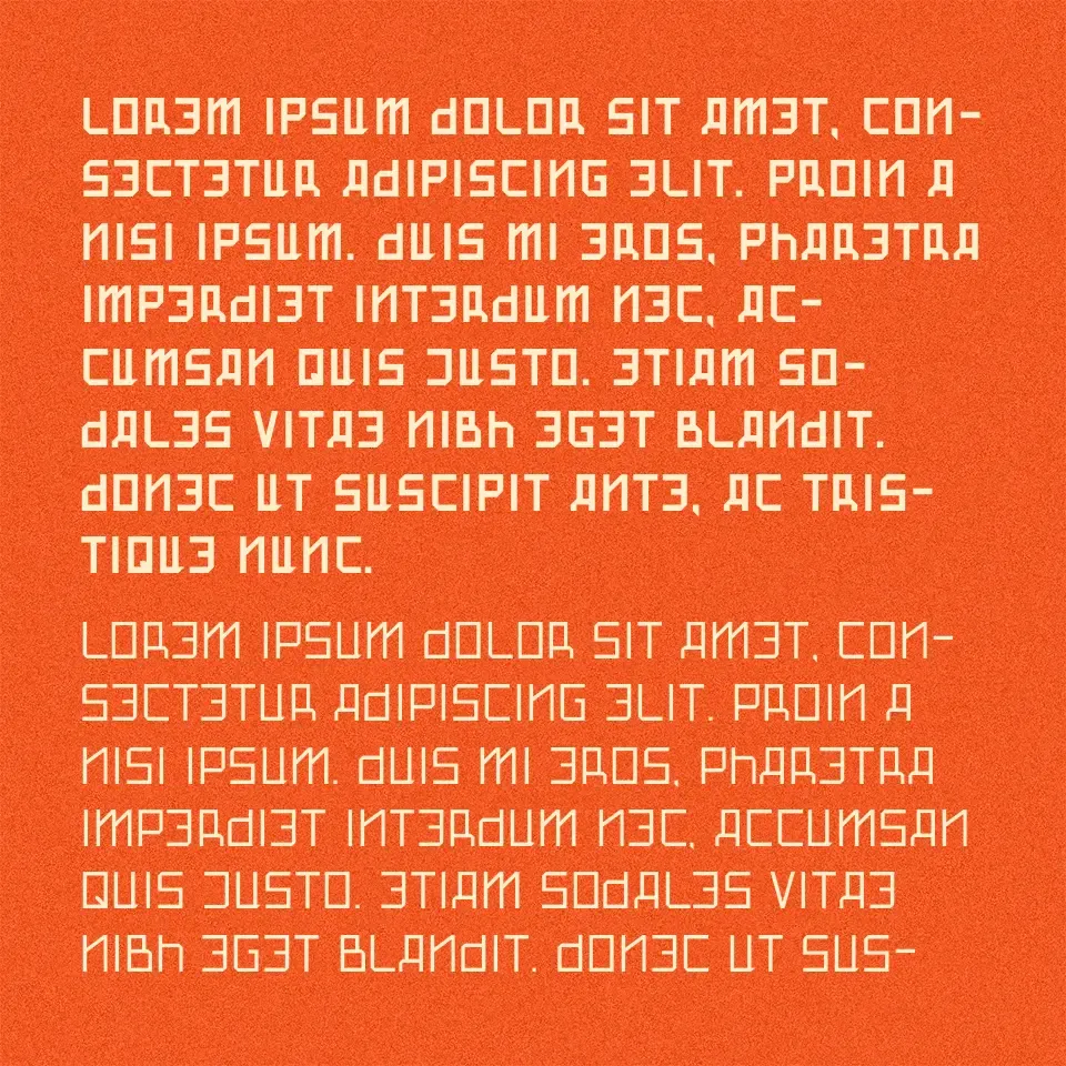
Alterna
Alterna is a custom display typeface created for an exhibition built around a speculative post-war political fiction. Rooted in Roman forms but influenced by Cyrillic structures, constructivism, and brutalist aesthetics, it was designed to feel historically grounded yet subtly distorted.
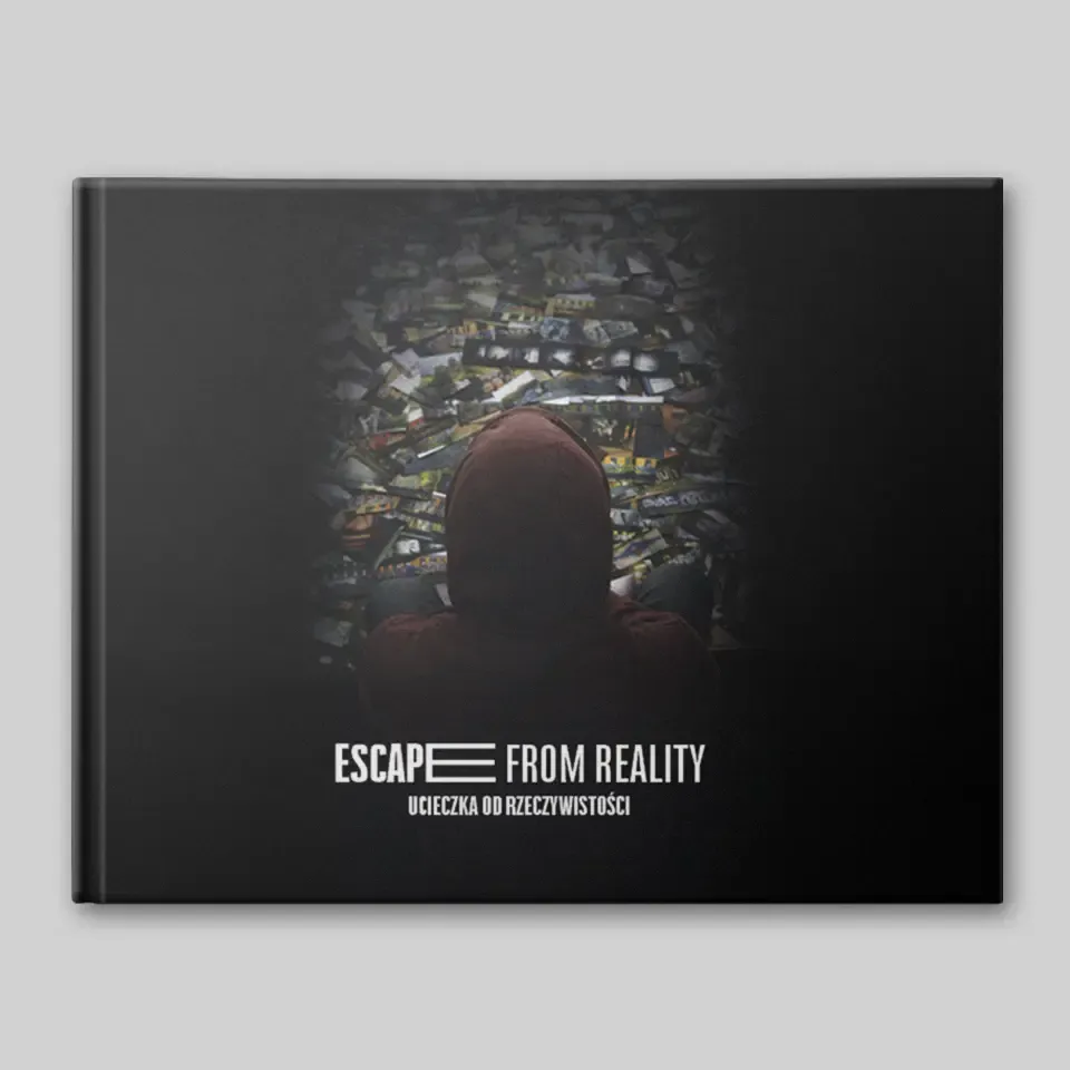

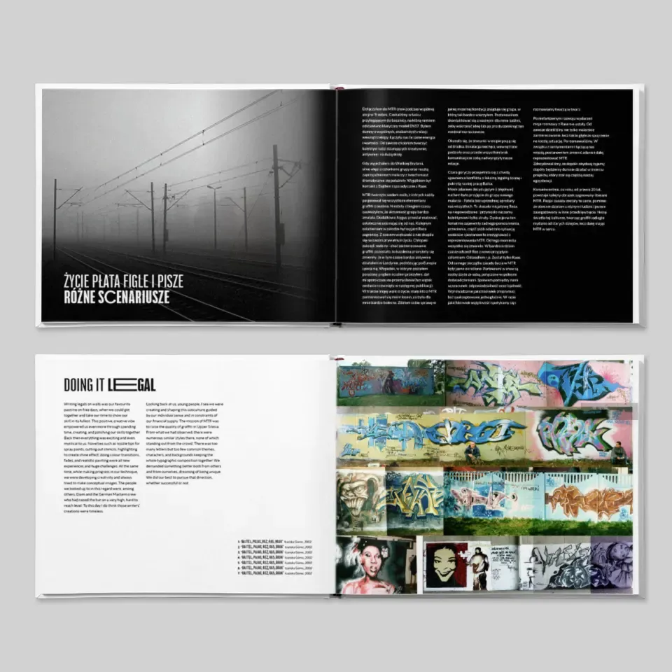
Escape From Reality
Escape From Reality is a bilingual publication documenting the early years of a graffiti writer. Instead of the usual album format, it uses a more editorial approach, combining archival material, storytelling, and strong typographic hierarchy to create narrative flow.
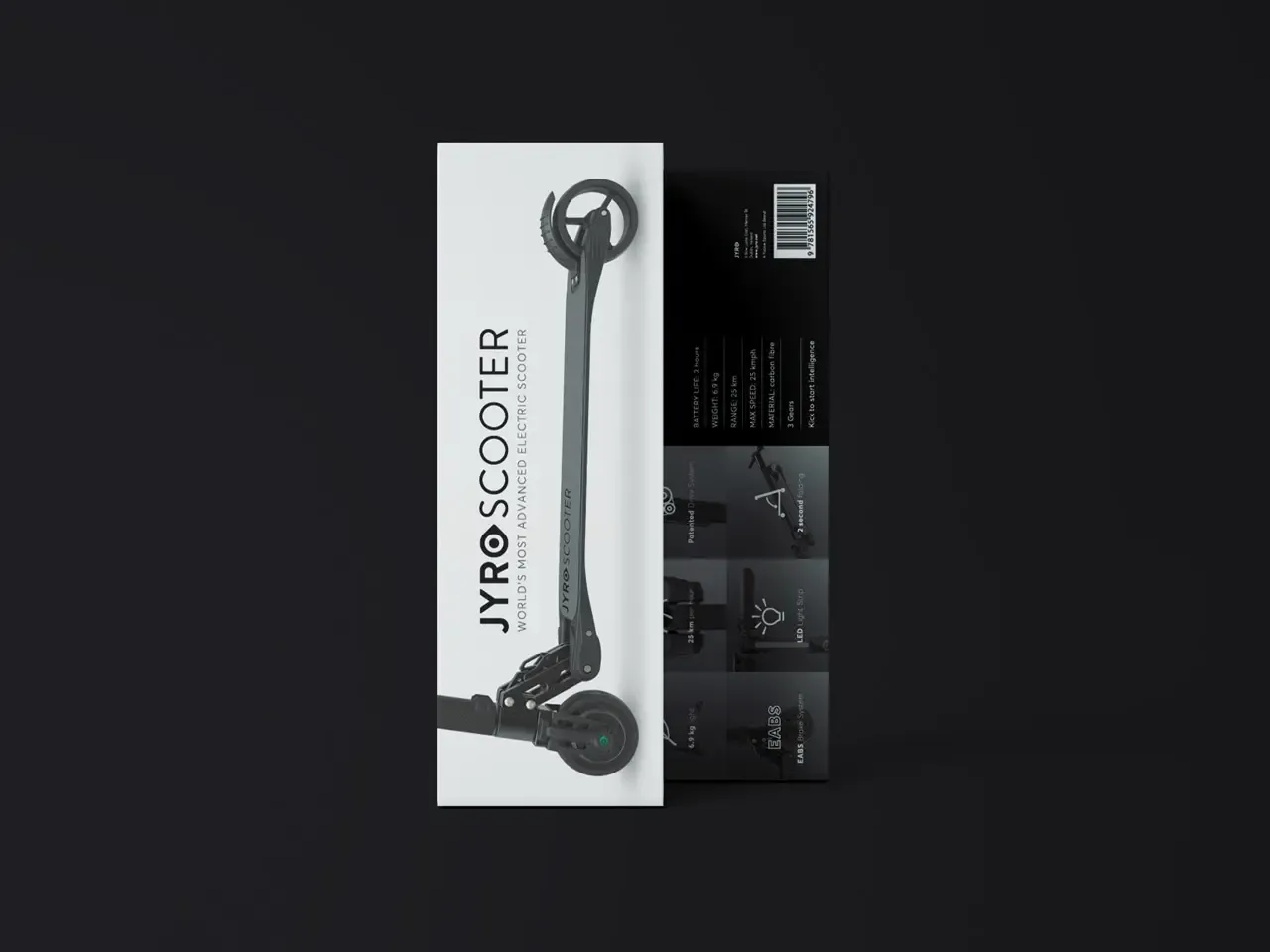

Packaging
A selection of packaging work across technical, industrial, and consumer products. The focus is on clear structure, practical layouts, and visuals that translate cleanly from flat design to finished packaging.
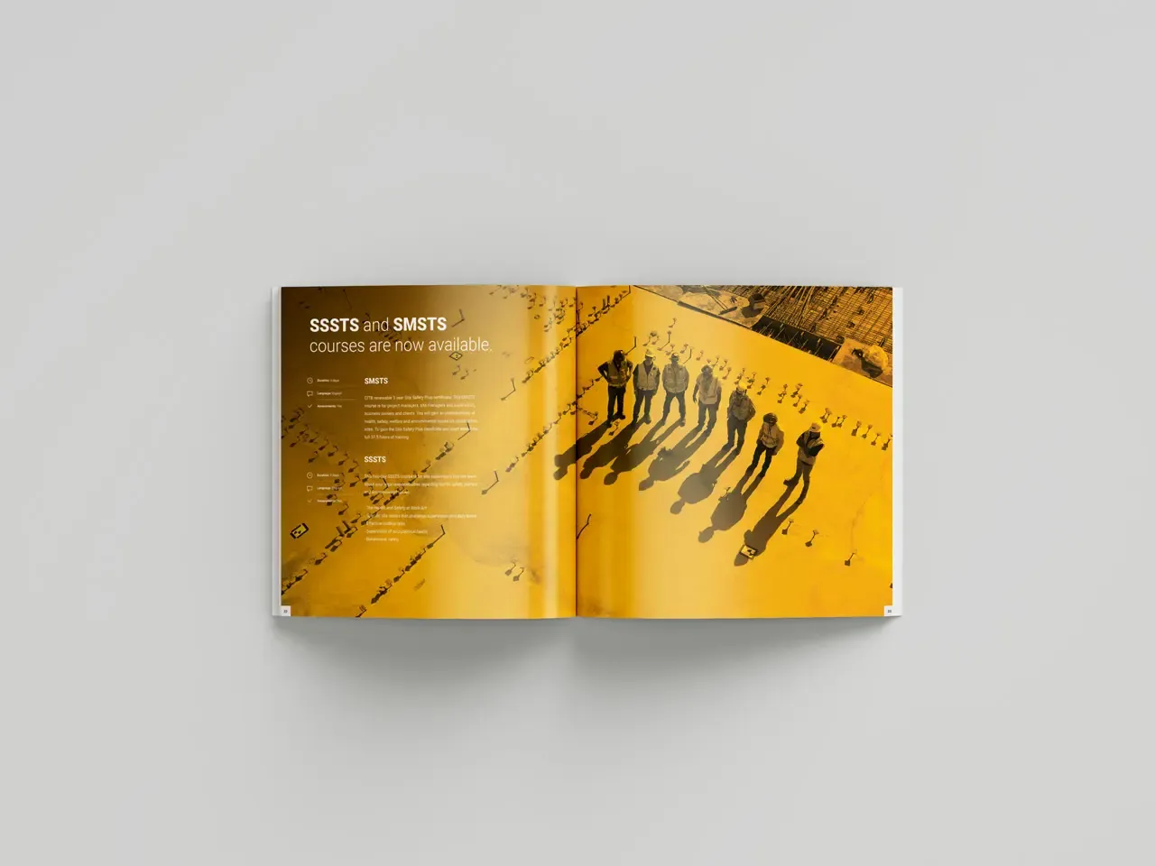
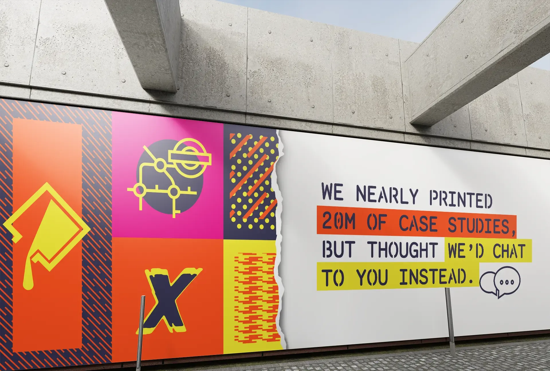
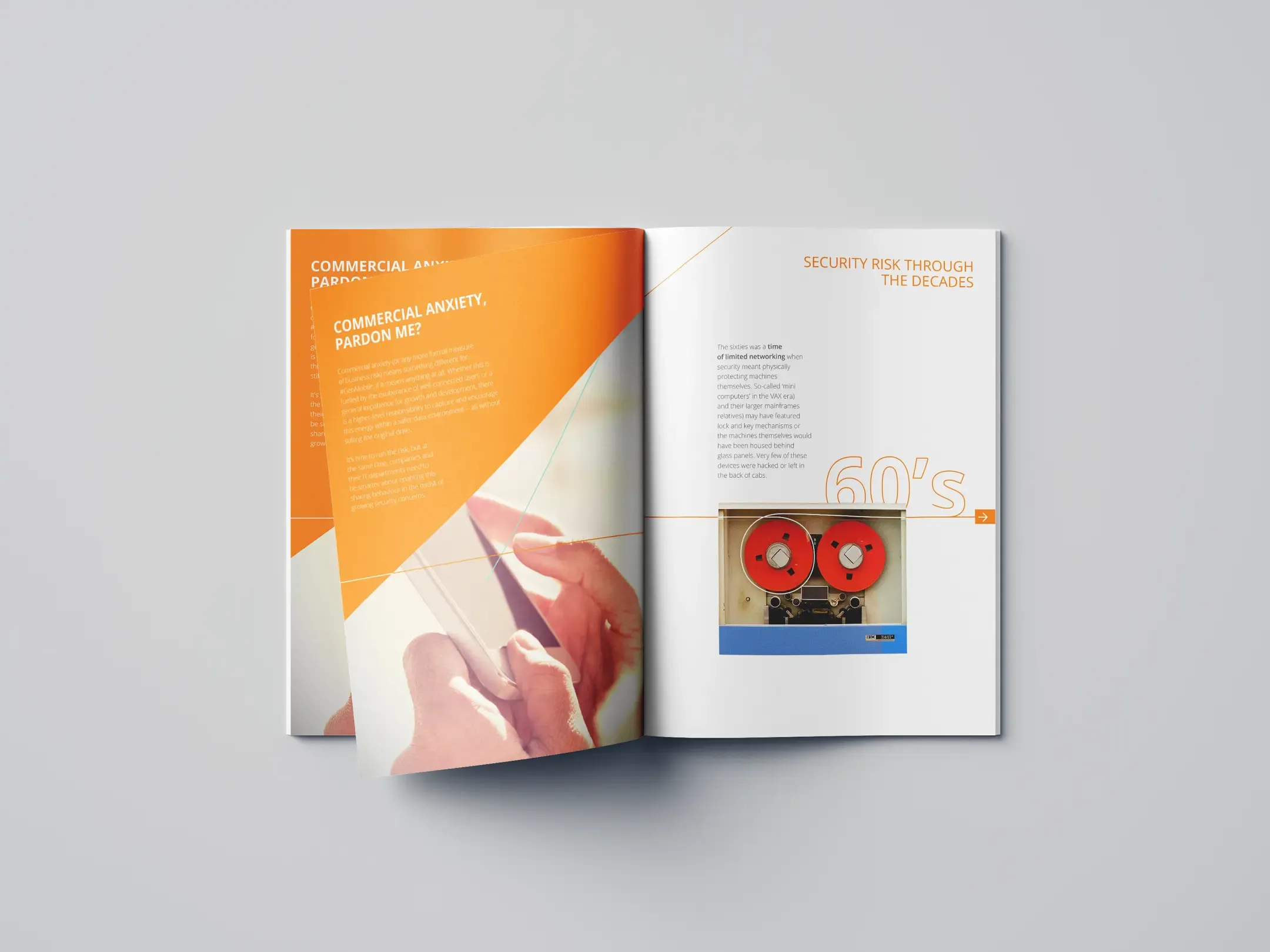
Print work across formats ranging from books and brochures to hoardings and small-format materials. The projects combine layout, typography, and production detail to make sure ideas translate cleanly from screen to press.

Logos
A selection of logo work across different industries and product types. The focus is always on fit: adapting tone, expression, and complexity to the brand, product, or service each mark needs to represent.
Alterna
Alterna is a custom display typeface created for an exhibition built around a speculative post-war political fiction. Rooted in Roman forms but influenced by Cyrillic structures, constructivism, and brutalist aesthetics, it was designed to feel historically grounded yet subtly distorted.
Escape From Reality
Escape From Reality is a bilingual publication documenting the early years of a graffiti writer. Instead of the usual album format, it uses a more editorial approach, combining archival material, storytelling, and strong typographic hierarchy to create narrative flow.
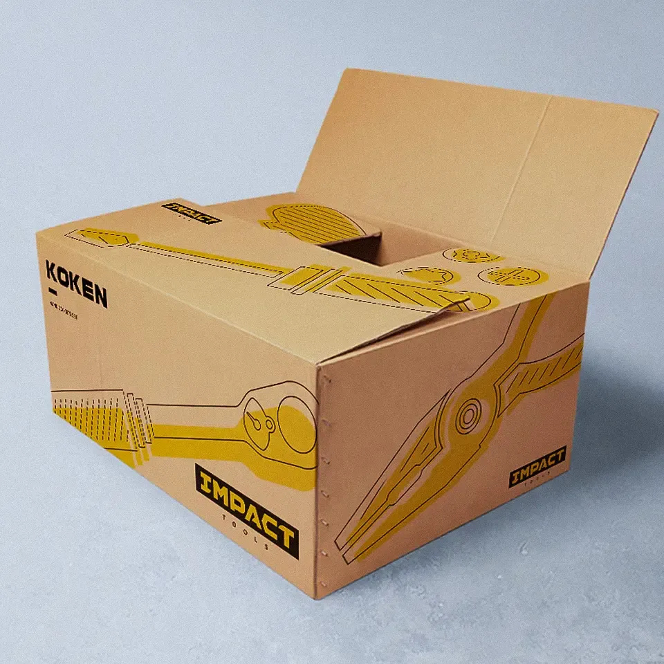
Packaging
A selection of packaging work across technical, industrial, and consumer products. The focus is on clear structure, practical layouts, and visuals that translate cleanly from flat design to finished packaging.
Print work across formats ranging from books and brochures to hoardings and small-format materials. The projects combine layout, typography, and production detail to make sure ideas translate cleanly from screen to press.
Logos
A selection of logo work across different industries and product types. The focus is always on fit: adapting tone, expression, and complexity to the brand, product, or service each mark needs to represent.
Other
A selection of smaller projects across print, identity, packaging, and editorial design.
Alterna
Alterna is a custom display typeface created for an exhibition built around a speculative post-war political fiction. Rooted in Roman forms but influenced by Cyrillic structures, constructivism, and brutalist aesthetics, it was designed to feel historically grounded yet subtly distorted.
Escape From Reality
Escape From Reality is a bilingual publication documenting the early years of a graffiti writer. Instead of the usual album format, it uses a more editorial approach, combining archival material, storytelling, and strong typographic hierarchy to create narrative flow.
Packaging
A selection of packaging work across technical, industrial, and consumer products. The focus is on clear structure, practical layouts, and visuals that translate cleanly from flat design to finished packaging.
Print work across formats ranging from books and brochures to hoardings and small-format materials. The projects combine layout, typography, and production detail to make sure ideas translate cleanly from screen to press.
Logos
A selection of logo work across different industries and product types. The focus is always on fit: adapting tone, expression, and complexity to the brand, product, or service each mark needs to represent.